October 2021
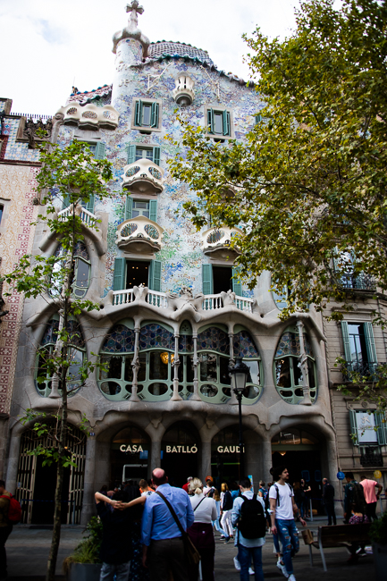
Casa Battló
When Antoni Gaudi graduated from Architecture school Elies Rogent, the Director of Barcelona Architecture School, apparently said: “We have given this academic title either to a fool or a genius. Time will show.”
When walking the streets of Barcelona there is almost no other architectural style that overwhelms you as much as Catalan art nouveau or Modernisme. For this reason no other city has as many buildings on the UNESCO World Heritage List as Barcelona, and a large part of those were designed by Gaudi.
Casa Battló overwhelmed me. However, what grabbed me and would not let me go was the amazing high quality of craftsmanship. The wood kept me rapt at every turn.
Josep Batlló hired Gaudí to design his home in 1904. Batlló had planned to tear down the building and build an entirely new house. Gaudí convinced him that a renovation was sufficient. The building was completely refurbished by 1906.
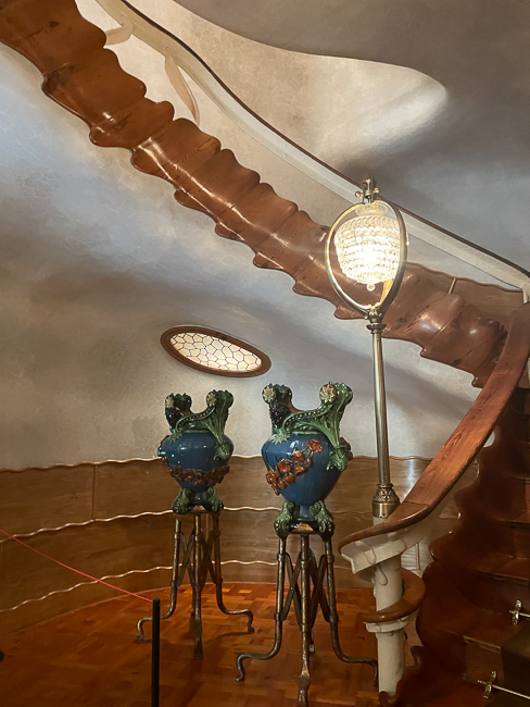
From the moment you walk into the entryway, you can not help but see the love and attention taken by the wood workers to make the wood downright sexual.
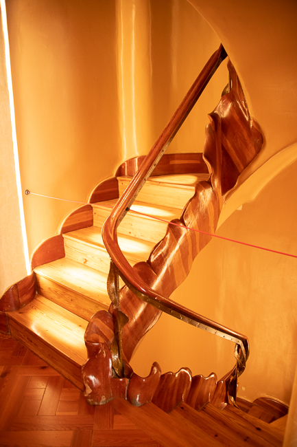
You are still in awe when you reach the top of the stair, with windows created by wood alone and a newel post that begs to be caressed.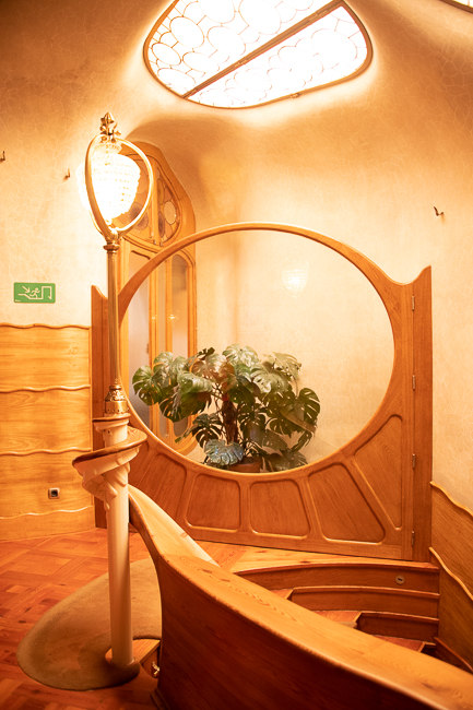
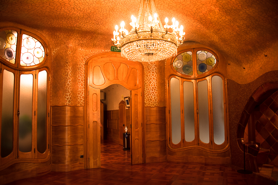
The architectural guidebooks I read said to remain in the room with the fireplace as long as you could, and I instantly knew why. 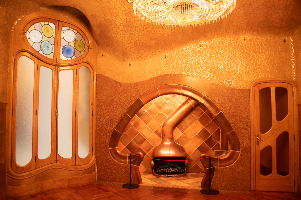
The golden tones of the plaster walls, the copper fireplace the parquet floor and the wood simply wrap you in a sensual blanket of warmth.
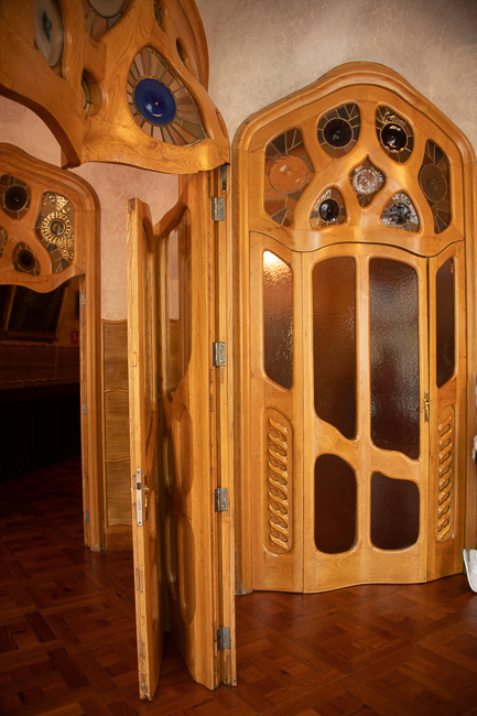
You leave that warm room and enter into an entirely new world, but not without passing through a wood door, that folds upon itself when as it closes, and yet is a work of art in its movement.
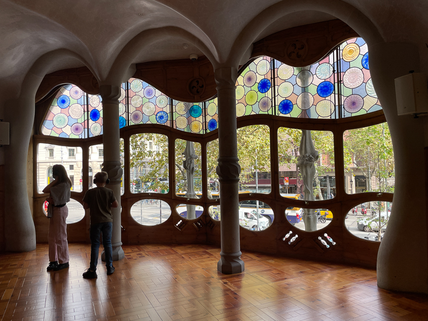
The next room is filled with light and while they aren’t something that scream at you, the round stained glass plays with you and dares you to look away from them and through the clear glass and the world outside. With that all going on you hardly realize you have so been seduced by the undulating plaster ceiling and walls – you are now within the grasp of the home, sucked in like a spider to the lair.
Another floor up, via another exquisite stairway
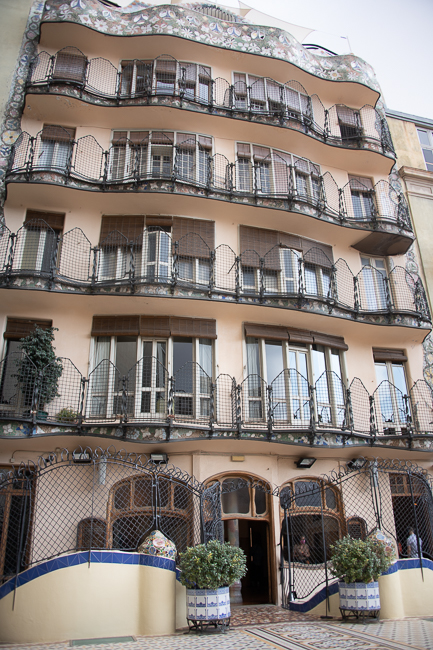
Brings you to the dining room. 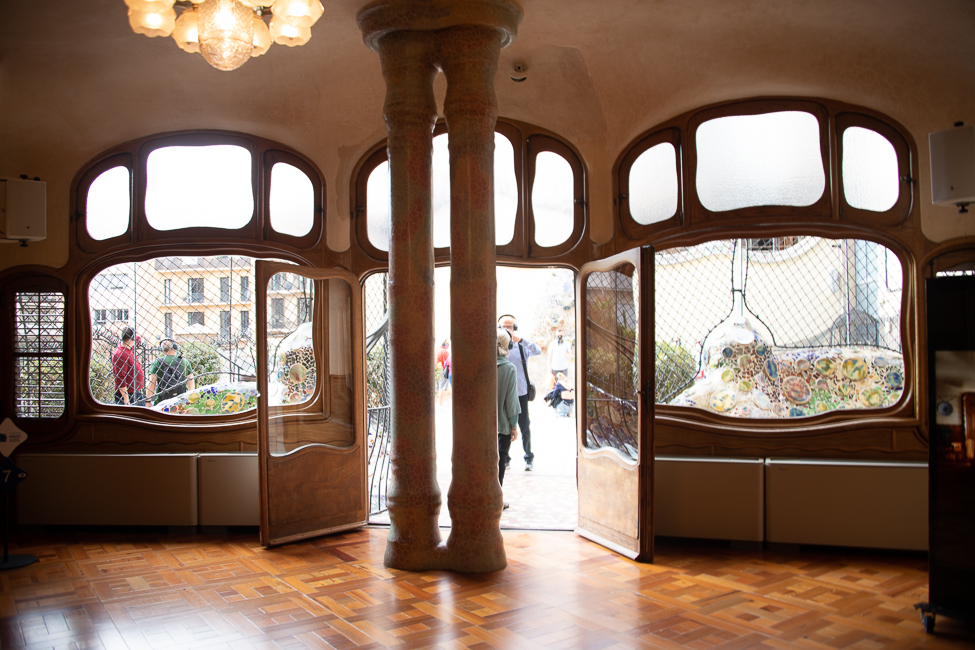 The lovely part of this room is that it opens onto a garden patio, with a view of the back of the building that helps you understand the layout of the building better.
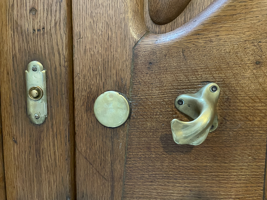
As was common at the time, the owners lived on the lower floors, the higher floors were for tenants. Even the doors to these apartments (not available for viewing) were sumptuous.
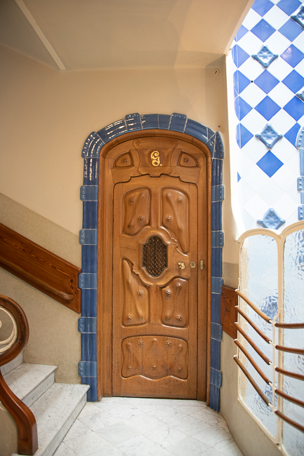
The attention to detail, right down to the hardware was awe inspiring.
The entire house is centered around a blue tiled vestibule, and it is gorgeous, not only for its light, but for Gaudi’s typical use of playing with light and dark hues.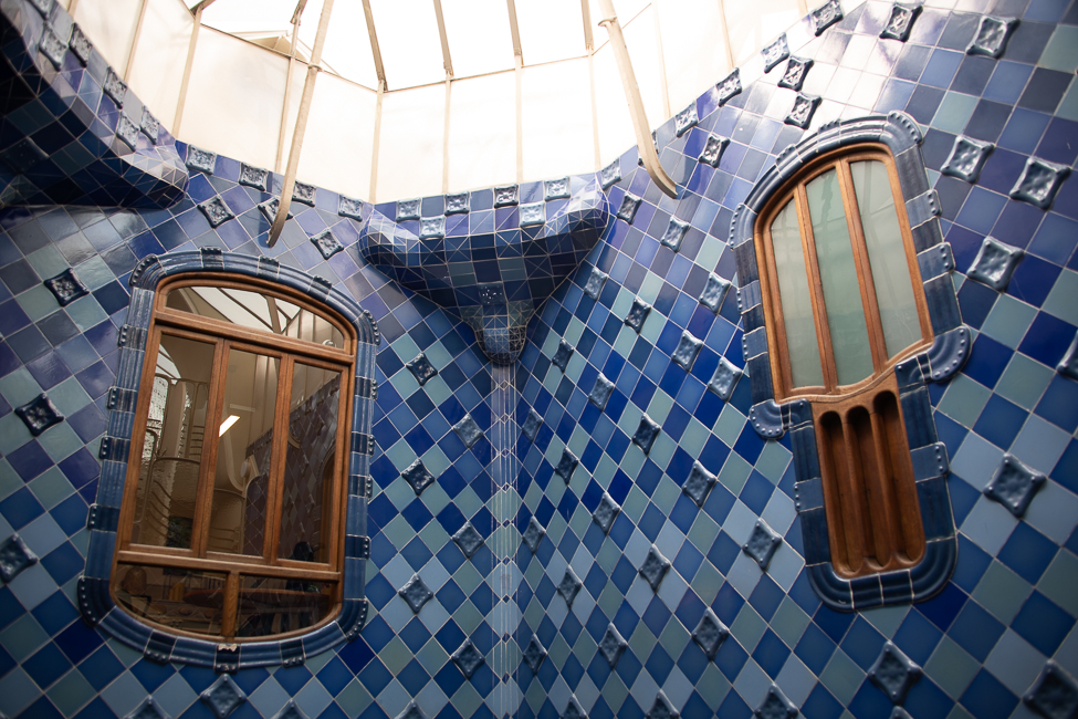
The Attic was the heart of the house, in other words, laundry, kitchen and maids quarters. And yet, despite its austerity there was sensuality and grace.
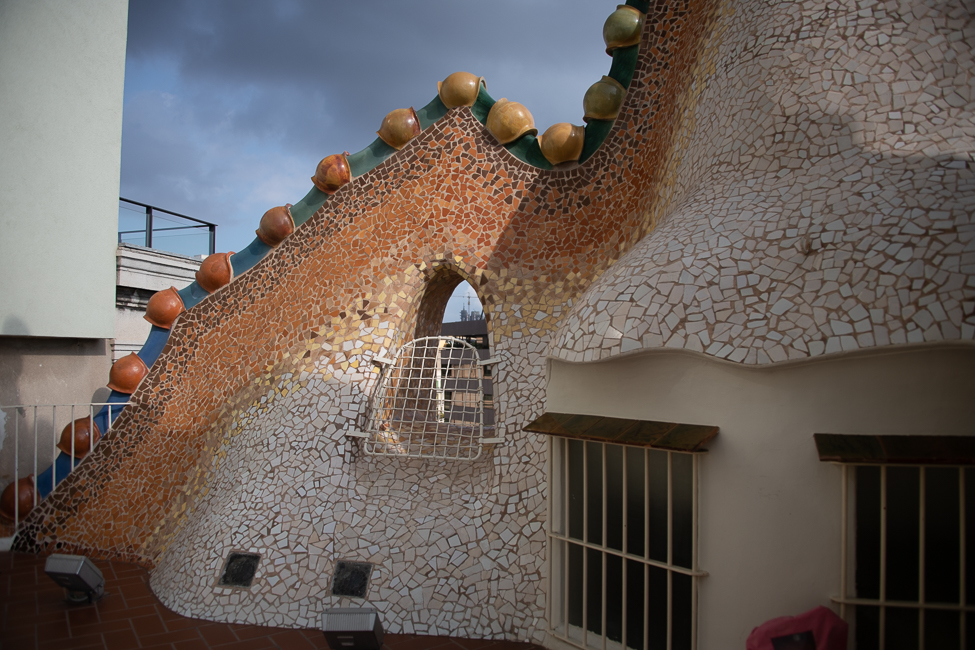
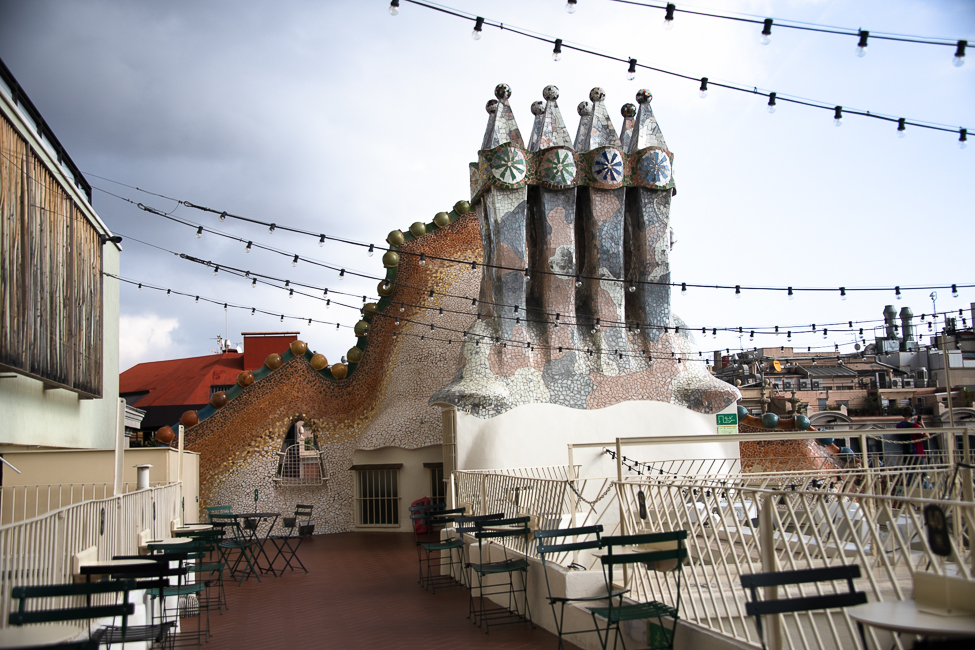
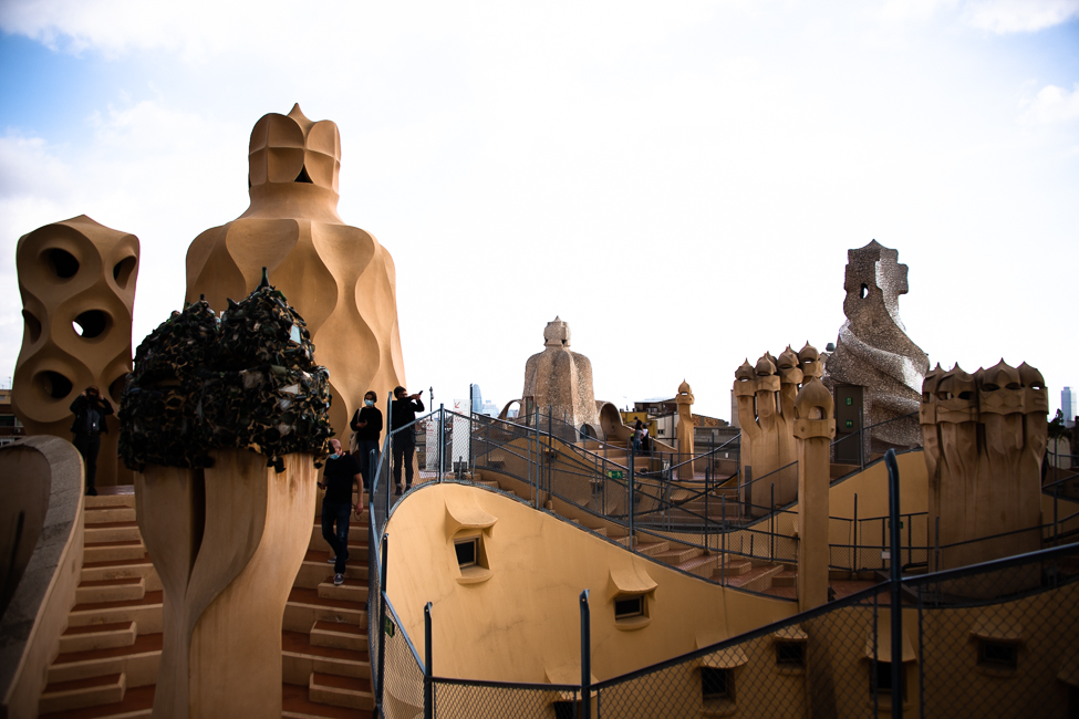
Then, of course, there was a typical Gaudi roof. The sad thing in so much of today’s world when great houses are made into museums, there is often an alteration of various aspects for a variety of reasons. Safety is the number one, but in this case, a cafe, i.e. another way to bring in income was added, which meant that the original feel was lost. One could enjoy the typical Gaudi chimneys but the magic really was gone.
Casa Mila
Much of Casa Mila has been transformed into a restaurant, and offices, so you really visit for the roof and the attic.
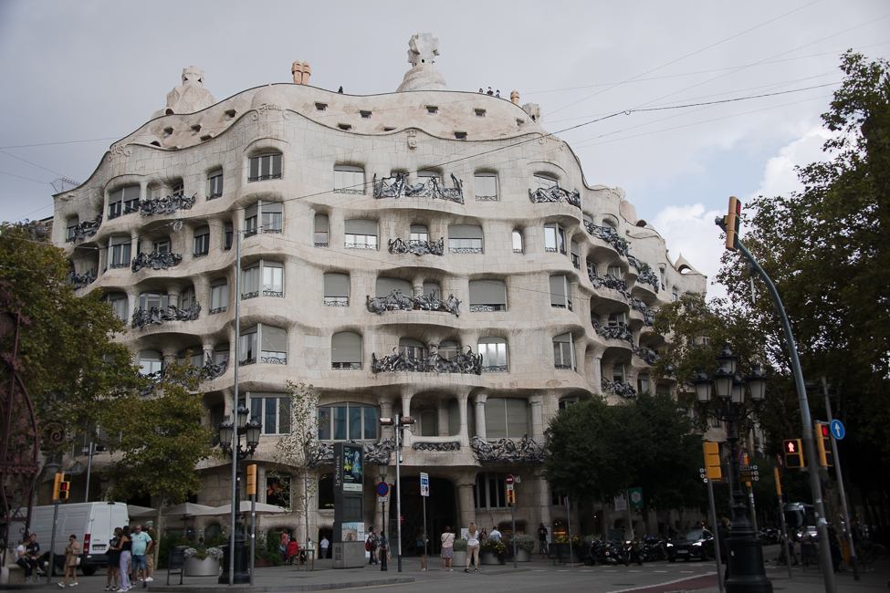
In 1984, the house was declared a UNESCO World Heritage Site. Since 2013 it has been the headquarters of the Fundació Catalunya La Pedrera which manages the building, the tours and exhibitions.
The building is nicknamed La Pedrera, or “the stone quarry”, a reference to its unconventional rough-hewn appearance
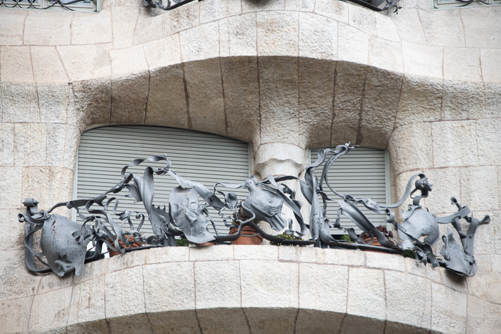
One of my favorite things of the buildings were the wrought-iron grilles of the 32 balconies. They were made using scrap iron sheets, bars and chains,
The rooftop:
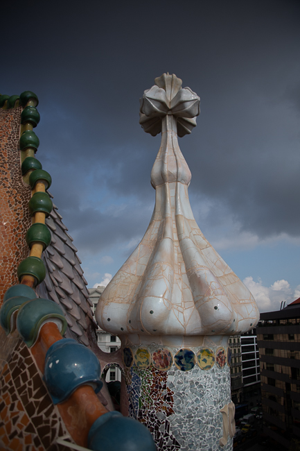
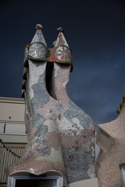
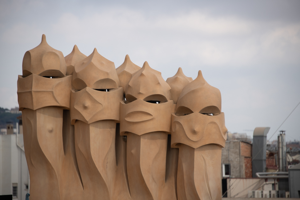
These are not chimneys. They are called the Guardians of the Rooftop. Some say that they are giants that come alive under a full moon, I for one, know where George Lucas got some of his inspiration.
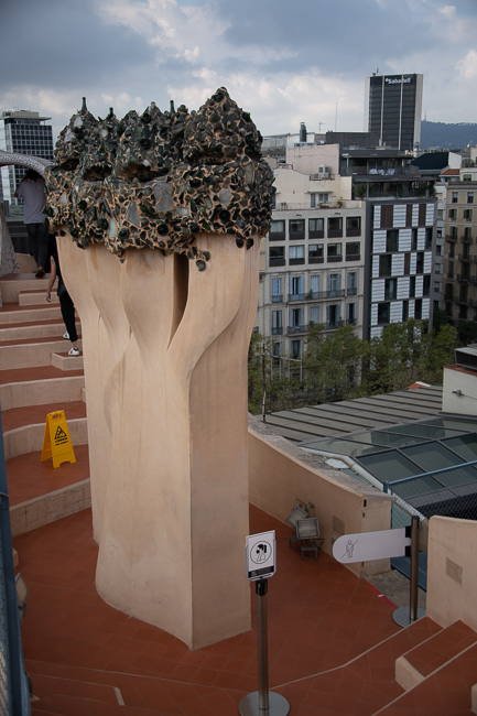
A champagne bottle glass topped chimney
The truth is the attic with its brick work was worth every penny of the entry fee.
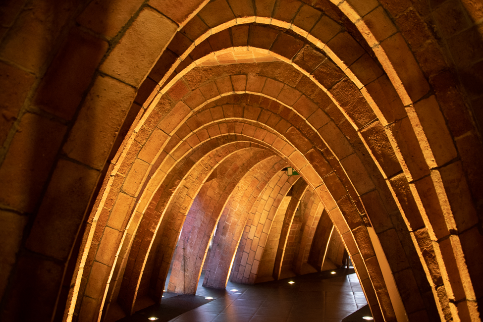
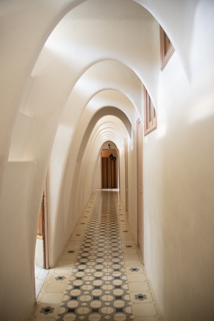
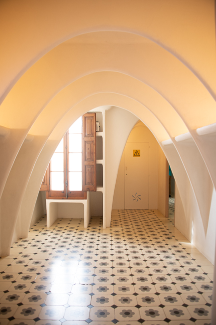
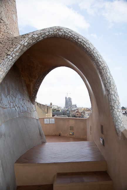
Gaudi constructed the attic on the slab of the top story. To avoid adding to the weight of the building, 270 catenary arches made of brick were used to support the roof terrace. A catenary arch is light, easy to build, supports itself and needs no buttressing. The Gateway Arch of Saint Louis is a catenary arch.
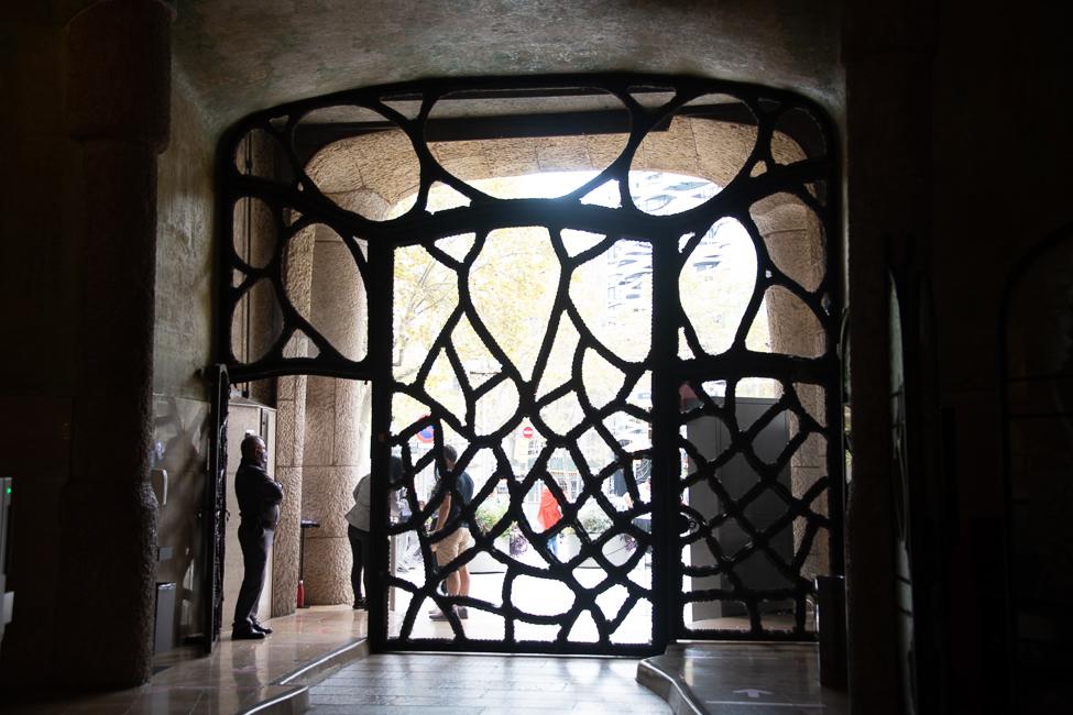
This building was designed with a garage. The intention of these huge doors was to allow entry by both humans and automobiles. Notice how the door that can be opened in the middle for cars, and on the two sides for humans.
Inside this vestibule is the entry hall.
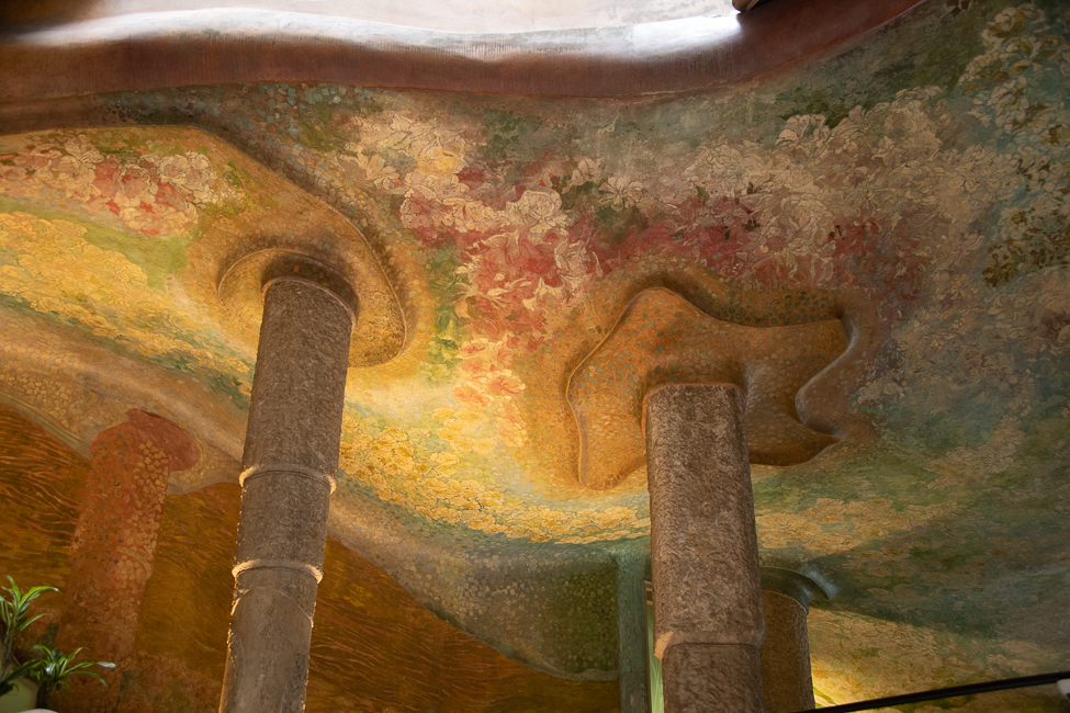 The Symbolist painter Aleix Clapés (1850 – 1920) was commissioned to oversee the pictorial decoration of Casa Mila.
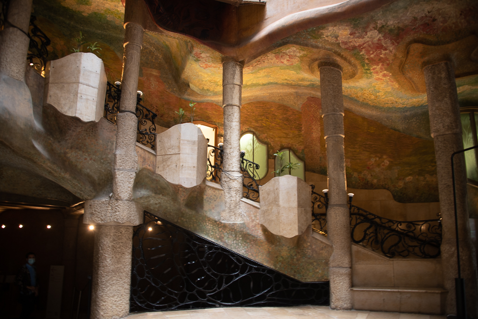
There is one apartment available for view in the building, but after Casa Battló it hardly seemed worth the effort.
Casa Calvet
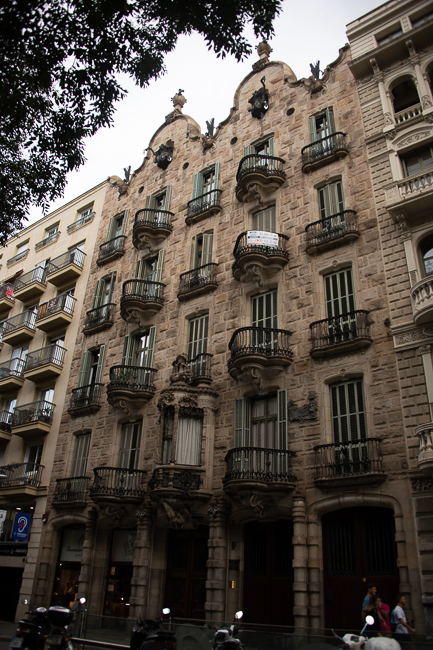
Casa Calvet (which served as both a commercial property and a residence for its owner, a textile baron.
Gaudí scholars agree that this building is the most conventional of his works, partly because it had to be squeezed in between older structures and partly because it was sited in one of the most elegant sections of Barcelona. Its symmetry, balance and orderly rhythm are unusual for Gaudí’s works.
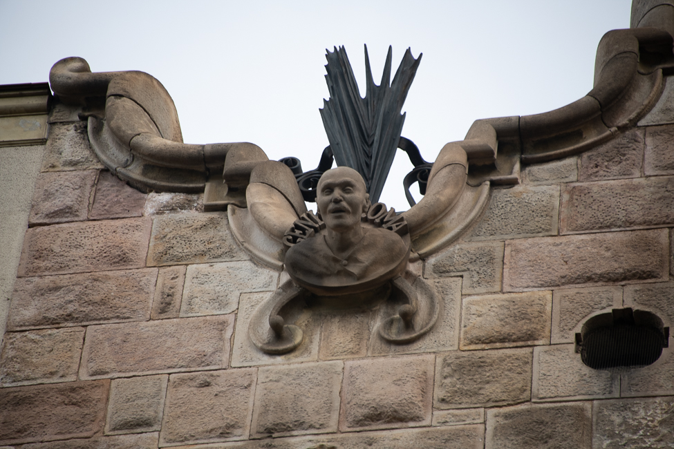
Three sculpted heads at the top although, I do not know which is which, are Sant Pere Màrtir Calvet i Carbonell (the owner’s father) and two patron saints.
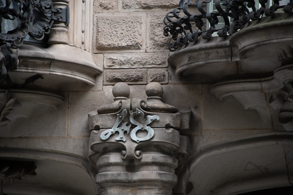
The building sits at 48 Carrer de Casp. It is not open to the public, but does have, according to friends, a wonderful restaurant on the ground floor.
